SUMMARY
Healing Transitions, previously known as The Healing Place, offers long-term recovery programs, overnight shelter, non-medical detox and family services to those in our community facing addiction. They serve more than 300 people a night and focus on the homeless, uninsured and underserved, offering services on demand through both a men’s and women’s campus.
CHALLENGE
- Brand confusion in the marketplace
- Inconsistent communications efforts to community members
- Negative stigma around addiction and recovery
SOLUTION
- Organizational brand refinement, including both visual identity and messaging
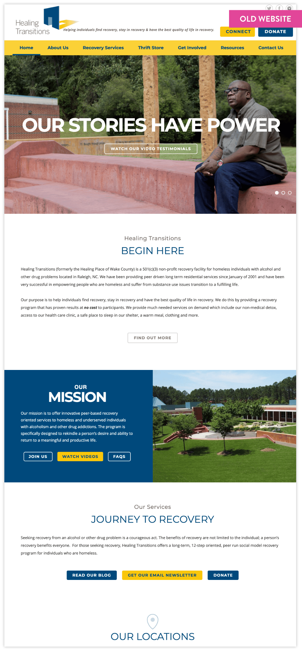
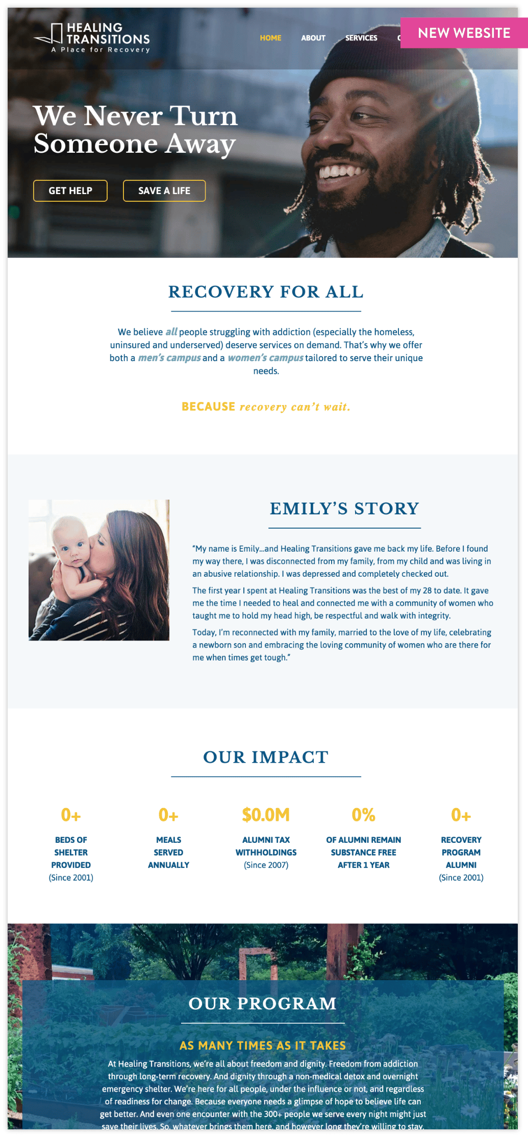
- New website providing increased brand integrity, as well as increased functionality, information flow and refined design
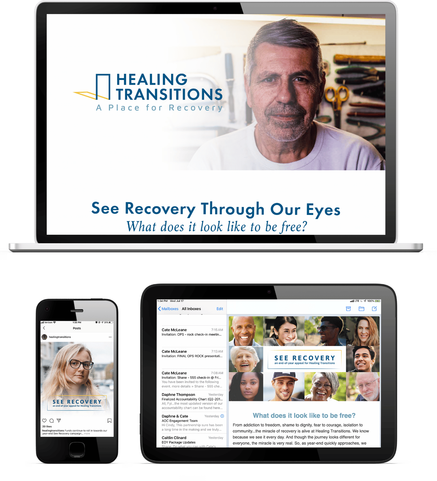
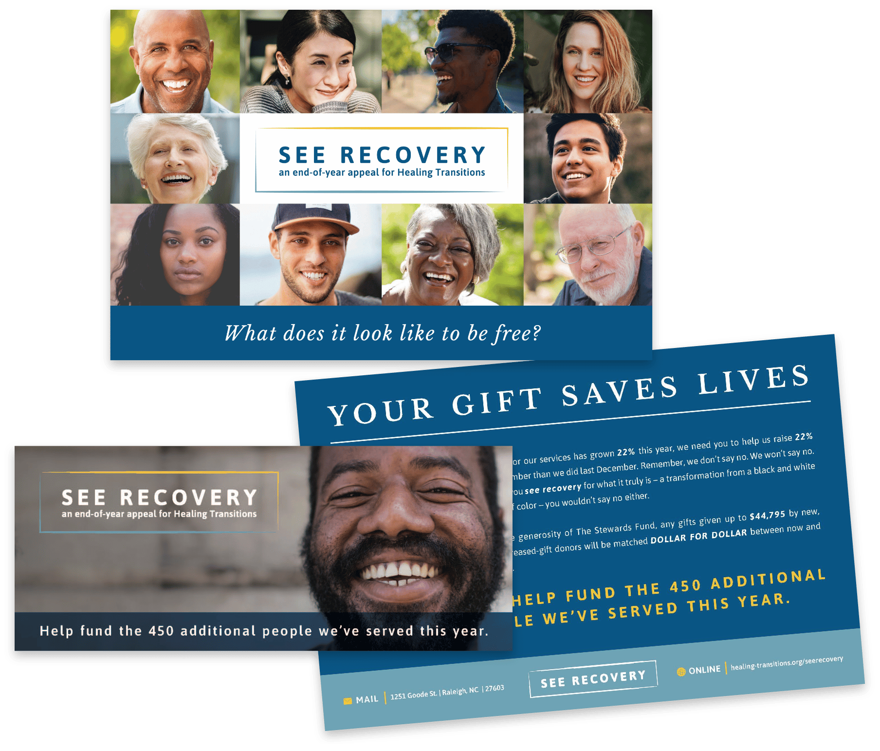
- Brand development for both a capital campaign and end-of-year campaign
- Integrated communications strategy with clear tactics and effective tools to engage current constituents and cultivate current and prospective donors with stories of recovery
OBJECTIVES
Strong branding
and standards
Increase public
awareness
Consistent
communications efforts
Prepare community for
capital campaign
STRATEGIES INITIATED
Organizational Rebrand & Capital Campaign Branding
(to drive affinity)
Ensuring excellent brands upheld with integrity and consistency.
Increased and Segmented Communications
(to deepen connection)
Providing meaningful, consistent and clear communications (both to internal constituents and to the general public) segmented per audience according to their vested interest.
Enhanced Donor and Prospective Donor Engagement
(to welcome effectively)
Improving the overall journey from first touchpoints to digital experiences to follow-up communication.
RESULTS
+92%
total donorship
End of Year Campaign
110%
raised of set goal
16
new donors
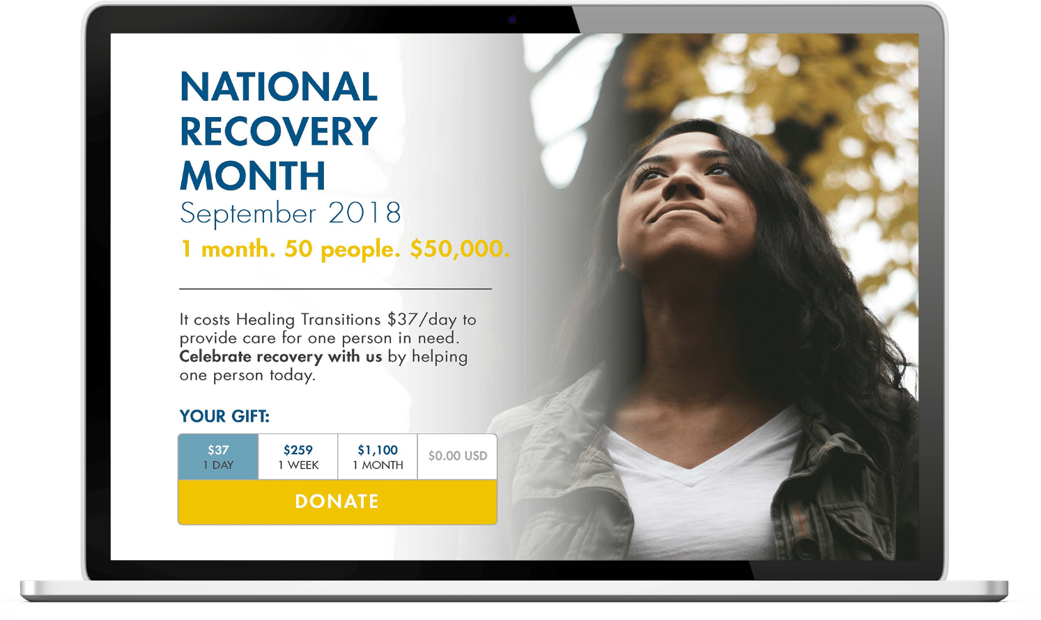
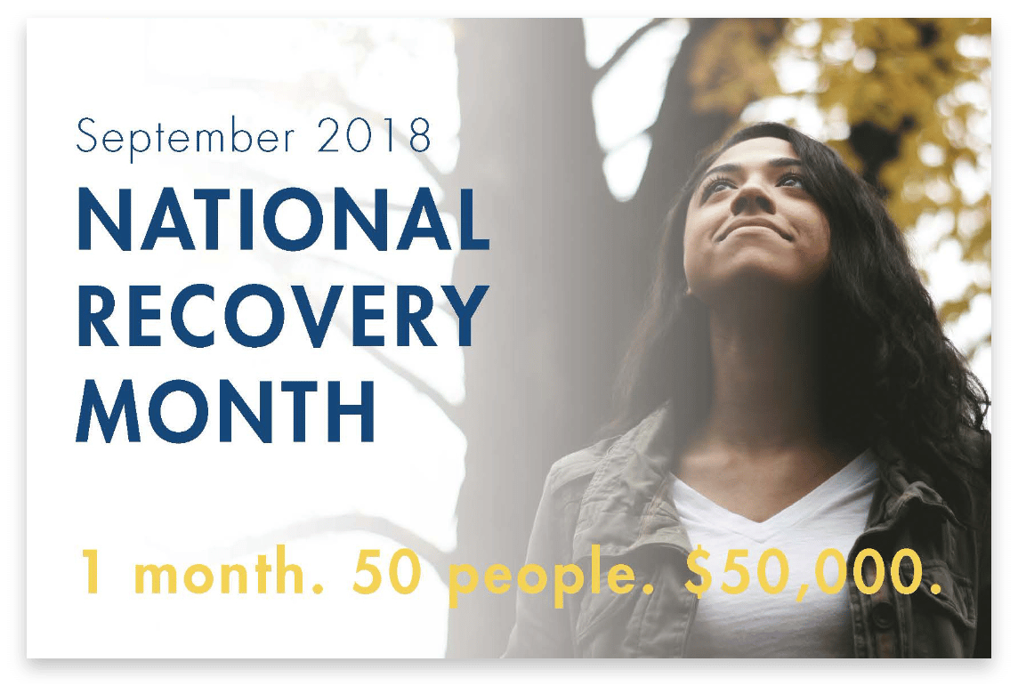
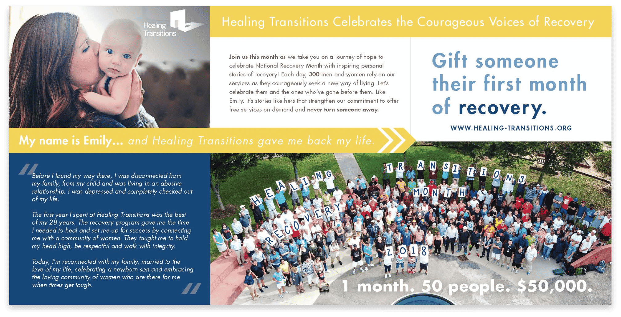
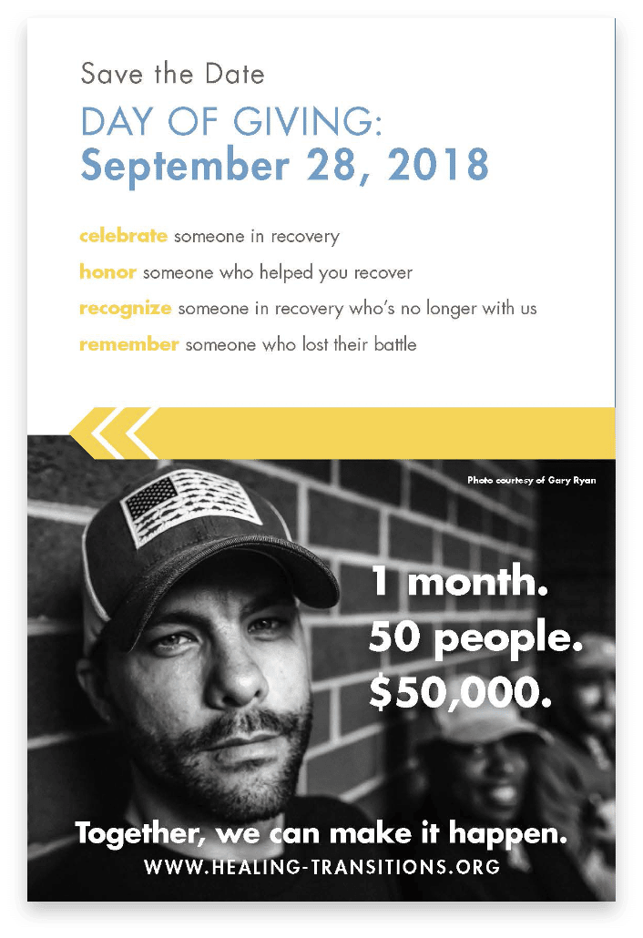
National Recovery Month Campaign
156%
raised of set goal
56
new donors
Brand Refinement
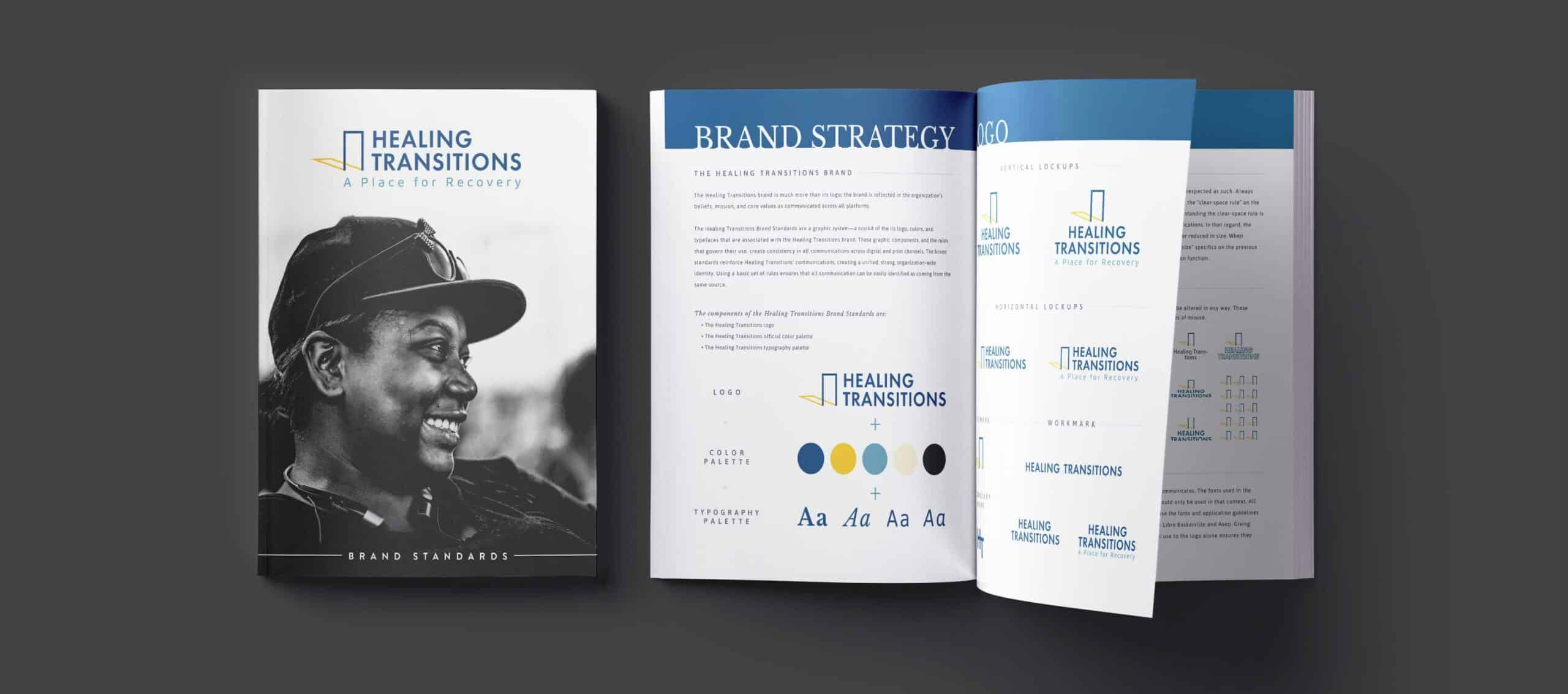
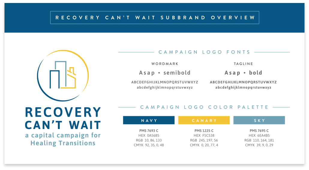
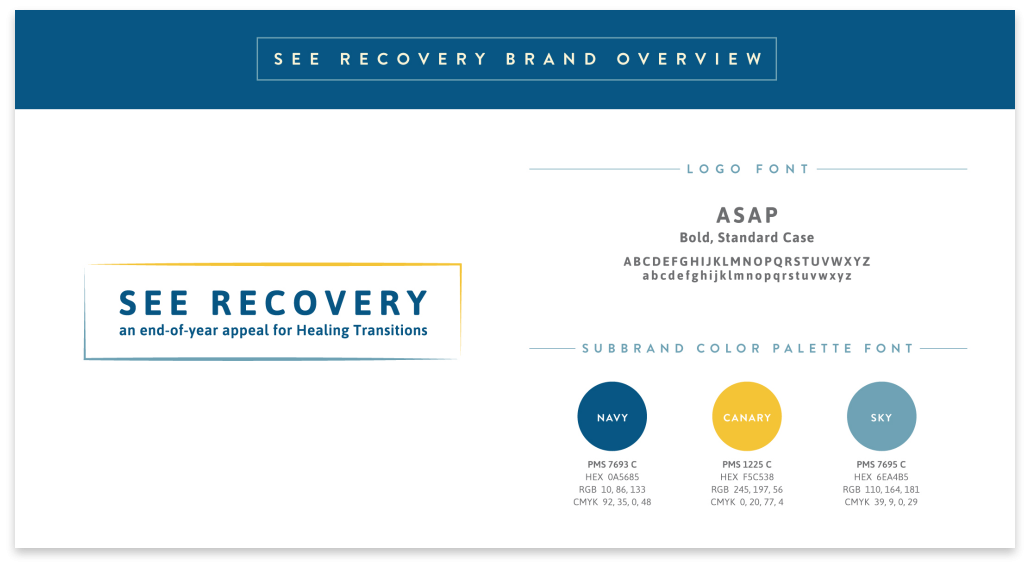
As part of an organization-wide effort to raise the integrity of Healing Transitions’ brand and increase public awareness in preparation for a capital campaign public launch in 2020, Angel Oak Creative overhauled Healing Transitions’ brand including both its logo and its messaging. In addition to formalizing branding standards, Angel Oak Creative built a marketing canvas to ensure consistency in messaging.
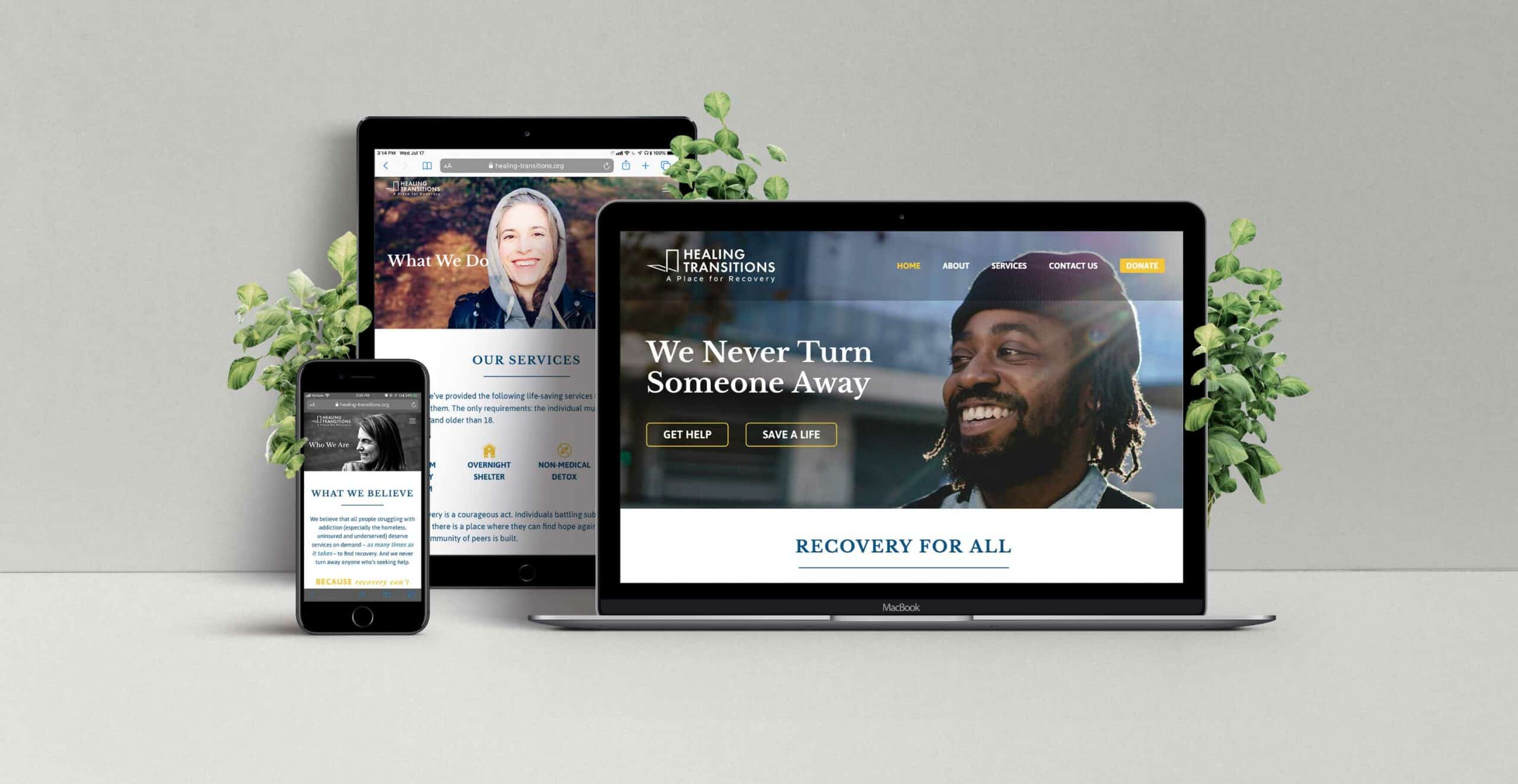
Website Overhaul
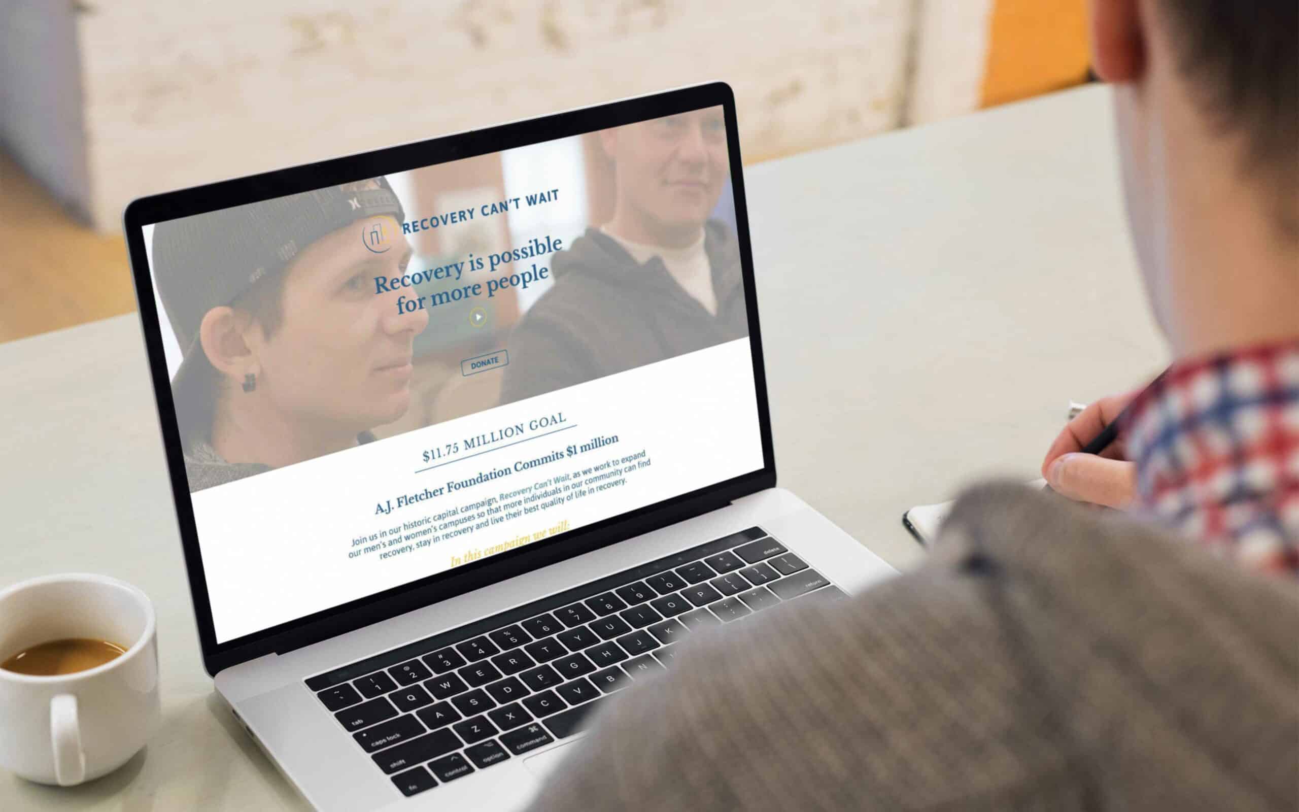
Angel Oak Creative also overhauled Healing Transitions’ website as another initiative to increase public awareness in preparation for a capital campaign public launch. The effort resulted in improvements to functionality, information-flow and refined messaging. Iconography and minimalistic design were also prime focuses of the updated website.
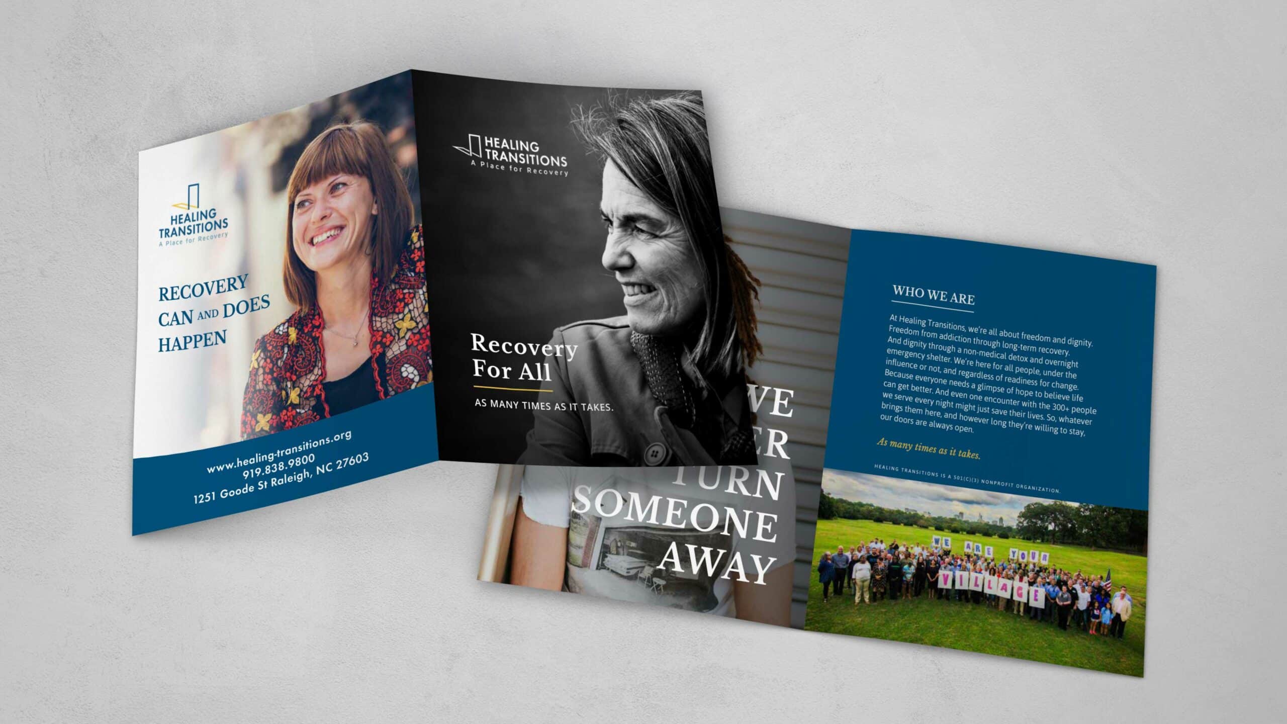
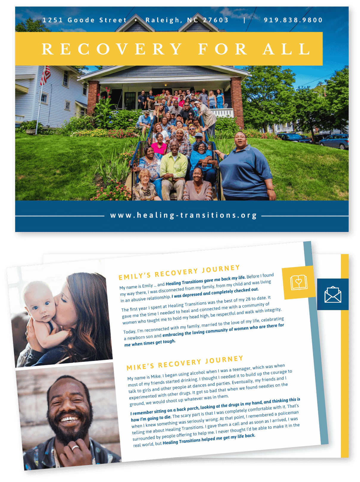
Collateral Development
Angel Oak Creative developed a number of collateral pieces focused on both the organization and the capital campaign. Examples include an organizational mini-booklet, annual report, impact story cards, a donor welcome packet, a corporate one-sheet and a capital campaign case statement to name a few.


Multimedia
Visual storytelling is an impactful way to showcase the power of recovery. Angel Oak Creative produced a testimonial piece told through the eyes of a Healing Transitions’ participant-turned-employee to accompany its annual report.
