1. Centrant: Rebrand
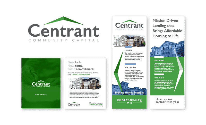
CICCAR (Community Investment Corporation of the Carolinas) —> Centrant
We loved this fresh, clean brand. The arrows resonate with the company’s drive to move people forward. Their green brought in growth and life. We developed a brand that was corporate enough to relate to the banking world but also has enough personality to resonate with the other side of the spectrum that Centrant serves. Win-win.
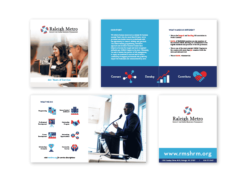
After seeing them through a rebrand, we got the chance to develop a piece of collateral that Raleigh Metro could use to explain their new “face” and what they do. This piece was fun! We navigated a new brand, and ultimately ended up with a piece they can leave behind with people that will always be a strong representation of who they are.
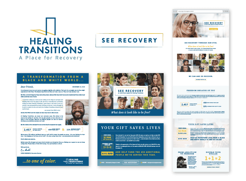
We came up with a solid end-of-year campaign package to show the hope of recovery with Healing Transitions. We showcased the many faces of struggling addicts and shared stories about hope and healing. The website’s interactive photo grid shows the transformation of individuals and how they moved from addiction to hope.
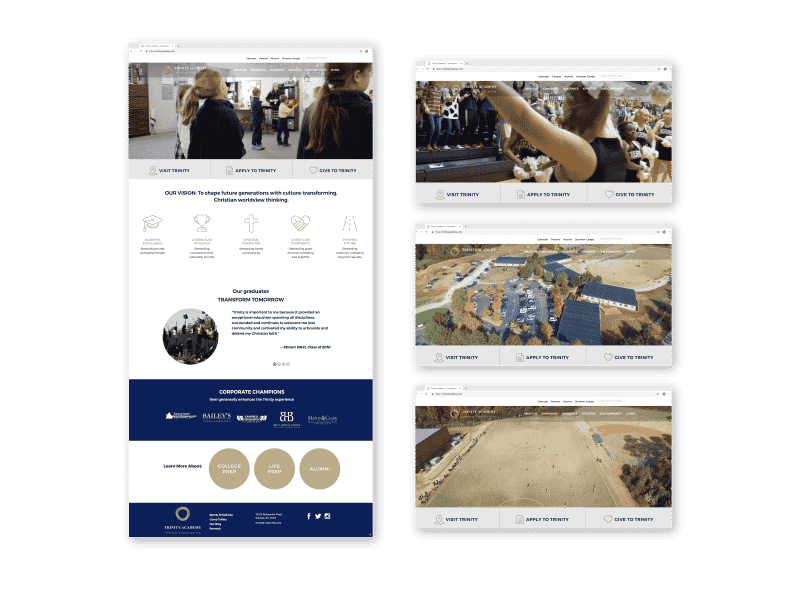
We did a huge website overhaul with Trinity that we love. We filmed a b-roll scroll of all Trinity has to offer its students and families and used it as the hero image at the top of the homepage. It’s awesome! The website leads you through a journey of discovering who Trinity is and gives you direct calls to action throughout — aka, easy for the user to get involved.
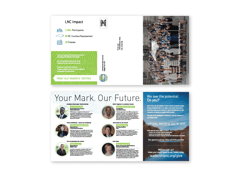
“Make Your Mark” was a campaign we helped LNC develop to better engage their alumni base. We wanted to instill a sense of pride for the alumni and show stories of continued connection among classes. We highlighted the success of the program and all of its benefits. We carried a fingerprint theme throughout the brand, helping to encourage alumni to join in and leave their mark on North Carolina!

